What we're doing today
This is a hands-on class — the live walkthrough from my Claude Foundations: Design session at Master Claw 2026. We're going to explore a new tool from Anthropic called Claude Design.
A few things to know before we start:
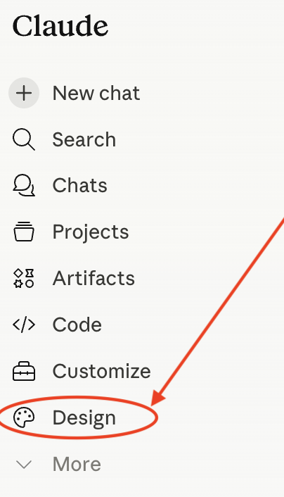
- You access it through claude.ai — the web version. Once you're logged in, click Design in the left sidebar.
- It's not available in the mobile app yet.
- It's a research preview feature. That means it's new and still evolving — what you see in your account today may look slightly different next week.
You don't need to be a designer for this. You don't need to know any code. You do need to be willing to give Claude direct feedback when its first attempt isn't right — because that's most of the skill we'll be practicing.
What we're going to build
We're going to design a landing page (a homepage) for a fake brand called CircleBack.
CircleBack — "The only email reply tool that respects how busy you are."
CircleBack auto-replies to your stale email threads so you don't have to. The product runs on three escalation rules:
- Anything older than 72 hours → "Circling back on this!"
- Anything older than 7 days → "Just bumping this to the top of your inbox"
- Anything older than 14 days → "Is this still on your radar?"
CircleBack also has a CRM integration that logs every fake follow-up as real outreach activity, so reps can hit their activity goals while doing approximately nothing.
Pricing tiers: Solo Circler · Team Circler · Enterprise Circle of Life
It's a parody, obviously. But the goal of this class isn't comedy — it's to show you how to take any product description, no matter how serious or silly, and turn it into a real, on-brand landing page using Claude Design.
Download the brand guide before we start: Circleback_Brand_Guide_green.pdf (opens in a new tab). This is the design system we'll be loading into Claude in Step 1. Save it somewhere you can find it.
Step 1: Set up the design system
In Claude Design, every project starts with a design system — your brand's colors, type, voice, and components, all defined once and reused everywhere. You only set it up once per brand. From then on, every page or asset you generate will be on-brand by default.
You can have multiple design systems saved in your account (one per client, one per product), and pick which one a project uses. Today we're going to create one for CircleBack.
Here's how to set it up:
- At the top center of Claude Design, click "Create a design system". You'll land on a screen titled Set up your design system.
- In the "Company name and blurb" field, paste this:
CircleBack — "The only email reply tool that respects how busy you are." Auto-replies "circling back on this!" to any email older than 72 hours. Auto-replies "just bumping this to the top of your inbox" to any email older than 7 days. Auto-replies "is this still on your radar?" to anything older than 14 days. Has a CRM integration so it logs every fake follow-up as outreach activity. Pricing: Solo Circler, Team Circler, Enterprise Circle of Life. - Skip the GitHub, code folder, and
.figfile fields — we don't need them today. Those are for teams that already have a frontend codebase or a Figma file Claude can mine for style. - Under "Add fonts, logos and assets," upload the brand guide you downloaded — Circleback_Brand_Guide_green.pdf. This file is the full brand spec: colors, typography, voice rules, components, and a "don't do this" list. Claude Design will use it as the source of truth for everything that follows.
- Leave "Any other notes?" blank for now. The brand guide already covers everything Claude needs.
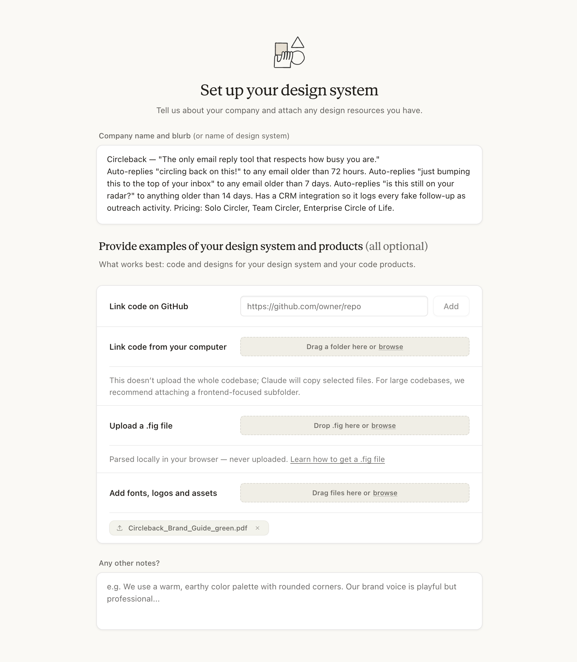
Now click Generate. You'll see this confirmation screen:
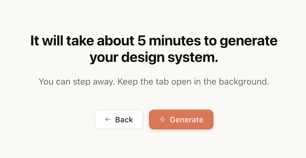
Hit Generate and let it run. Behind the scenes, Claude is taking the description and the brand guide and turning them into a full visual system that every later prompt will reference.
While you wait, open the brand guide and read it through. Pay extra attention to two parts:
- The cardinal rule: the design plays it 100% straight, the copy carries the comedy. If the visual design winks at the viewer, the joke dies in 10 seconds.
- The "Don't do this" list. Every item there is a trap Claude can fall into if you don't catch it.
These are the rules you'll be using to evaluate everything you generate today. If you don't know them, you can't enforce them.
Step 2: Review what Claude built
While Claude is still finishing your design system, it'll surface a review screen showing you everything it's built so far — typography, colors, spacing, components, brand voice — and ask you to weigh in. Your feedback shapes the rest of the build.
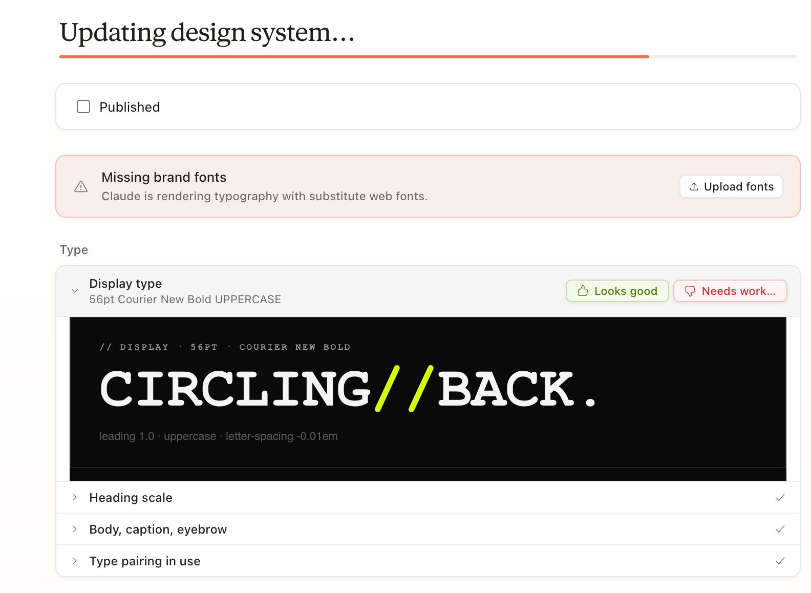
Claude organizes the design system into five groups with 19 sections total. Here's everything you'll be reviewing:
Type
- Display type
- Heading scale
- Body, caption, eyebrow
- Type pairing in use
Colors
- Core palette
- Neutral scale
- Color usage rules
Spacing
- Spacing scale
- Borders & radius
- Elevation = borders
- Motion tokens
Components
- Buttons
- Form inputs
- Metric cards
- Status badges
- Data table
- Cadence component
Brand
- Logo lockups
- Iconography
- Voice — sound vs don't
How to review each one:
- Click a section to expand it. You'll see Claude's actual interpretation — a typography sample, a color swatch grid, a button mockup, a "voice — sound vs don't" matrix, and so on.
- Compare it against the brand guide you uploaded. Does it follow the rules?
- If Claude nailed it, click Looks good.
- If something's off, click Needs work… and describe exactly what to change. Be specific. "Make it better" gets you nothing useful. "The display font should feel more editorial — try a serif with personality instead of Courier" gets you a real revision.
You may also see a "Missing brand fonts" warning at the top of the screen. That's Claude letting you know it can't extract actual font files from your PDF, so it's rendering type with the closest web font substitutes. If you have the licensed font files, click Upload fonts to give them to Claude. If you don't, ignore the warning — the substitutes are fine for today, and the rest of the system will still be on-brand.
Once you've gone through every section, your design system is locked in and ready to use.
Step 3: Start a new design
Once every section is reviewed, you'll see a "Your design system is ready" panel at the top of the screen. This is your green light to start building.
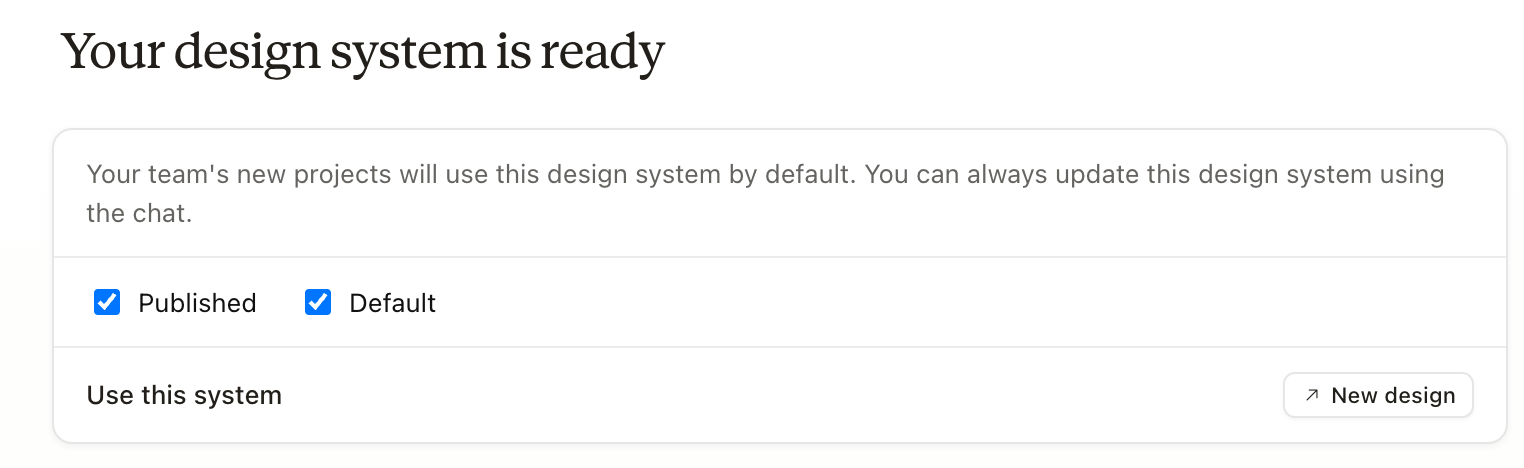
Two checkboxes show up here. Both should already be checked, and you can leave them that way:
- Published — makes the design system available for use across your team's projects.
- Default — sets it as the system new projects pull from automatically.
Now click New design. From here on, every page or asset you create will use the CircleBack design system automatically — colors, typography, components, voice. You won't have to remind Claude what brand you're working in. It already knows.
Step 4: Create the homepage prototype
You'll land on a new project setup screen. Fill it in like this:
- Project type: Prototype — the tab you start on. The other tabs (Slide deck, From template, Other) are for different deliverables; Prototype is the right choice for a single landing page.
- Project name:
CircleBack Homepage - Design system: Circleback Design System should already be selected as the default — that's the one you built in Steps 1–3.
- Fidelity: click High fidelity (the colorful card on the right, not the wireframe on the left). This tells Claude to generate a polished, production-ready page rather than a low-fidelity sketch.
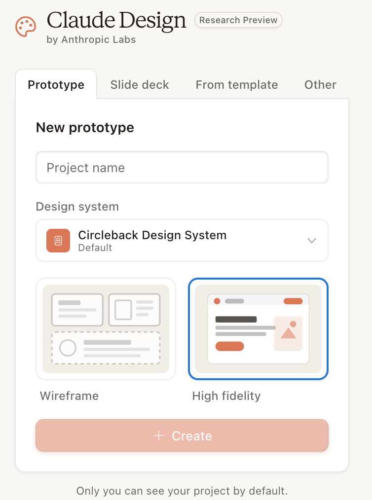
Click Create, and you're in.
Step 5: Send the build prompt
Now we hand Claude the actual build prompt — a detailed brief that spells out exactly what to make, section by section, with specific layout principles, motion rules, and a list of things to avoid. The longer and more specific the prompt, the better the output.
Copy this and paste it into Claude's chat input on your CircleBack Homepage project:
# Circleback Homepage // Build Prompt
**Mission:** Ship the production marketing homepage for Circleback. Long-scroll, fully interactive, brutalist. Brand system is loaded. Honor it strictly.
**Reader:** A head of sales who just spent 45 minutes guilty about their unanswered inbox. They should land on this page and feel relief, not pressure.
---
## Layout principles
- Asymmetric, left-aligned, max-width 1280px with 80px gutters.
- Visible 1px vertical grid lines at the page margins in `#222`.
- Section padding: 128px vertical on desktop, 64px on mobile.
- 0px border-radius. Everywhere. No exceptions.
- Hairline borders only. No drop shadows.
- Sticky terminal-style nav that fades in after 600px scroll.
---
## Sections (in order)
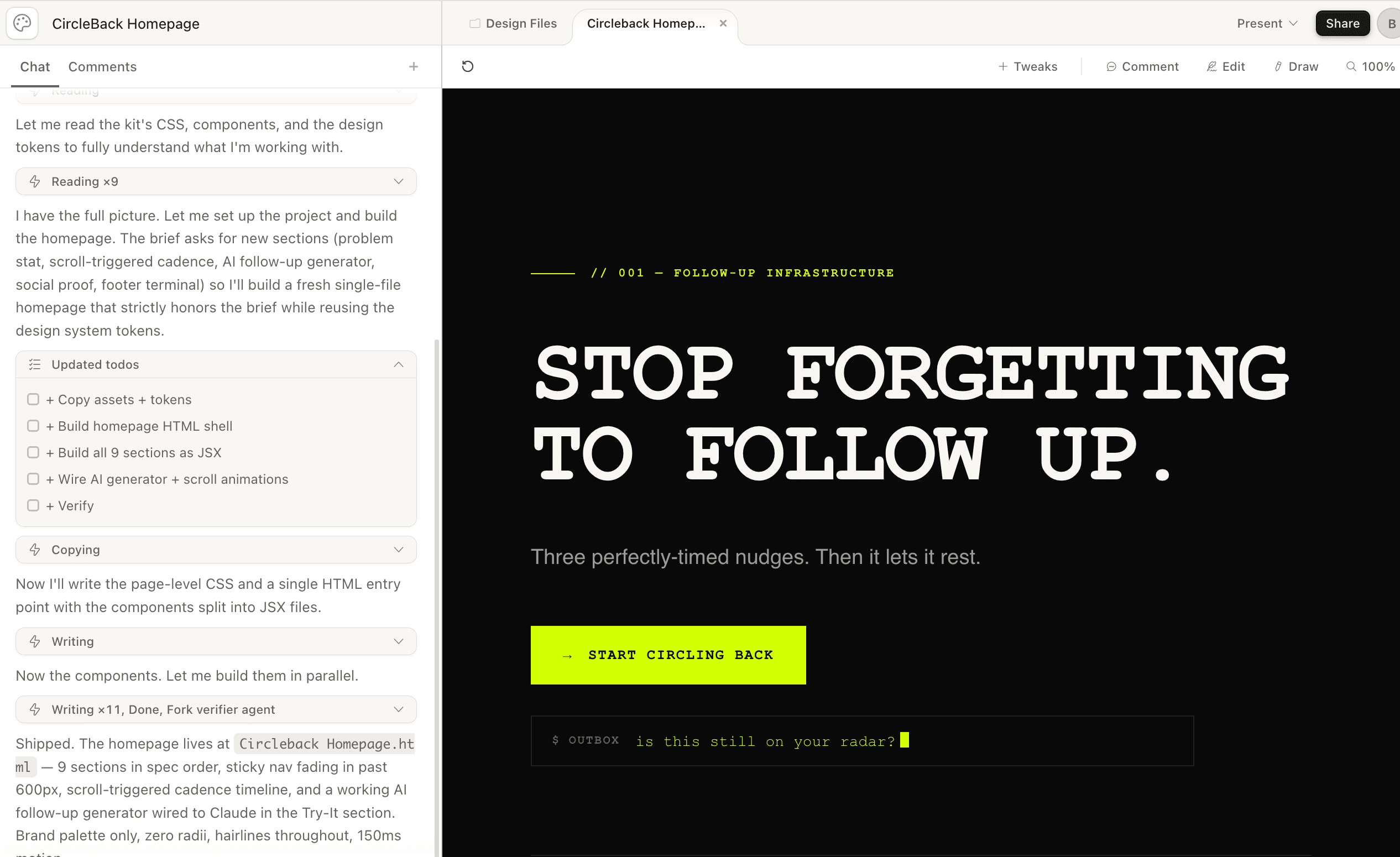
**01 // HERO**
Massive Courier New display headline: `STOP FORGETTING / TO FOLLOW UP.` Subhead in Helvetica: `Three perfectly-timed nudges. Then it lets it rest.` One primary CTA, lime background, no border-radius: `→ Start circling back`. Beneath the CTA, an animated terminal line with a blinking lime cursor that types-and-deletes through real follow-up phrases on a 2.5s loop: `circling back on this...`, `just bumping this to the top...`, `is this still on your radar?`.
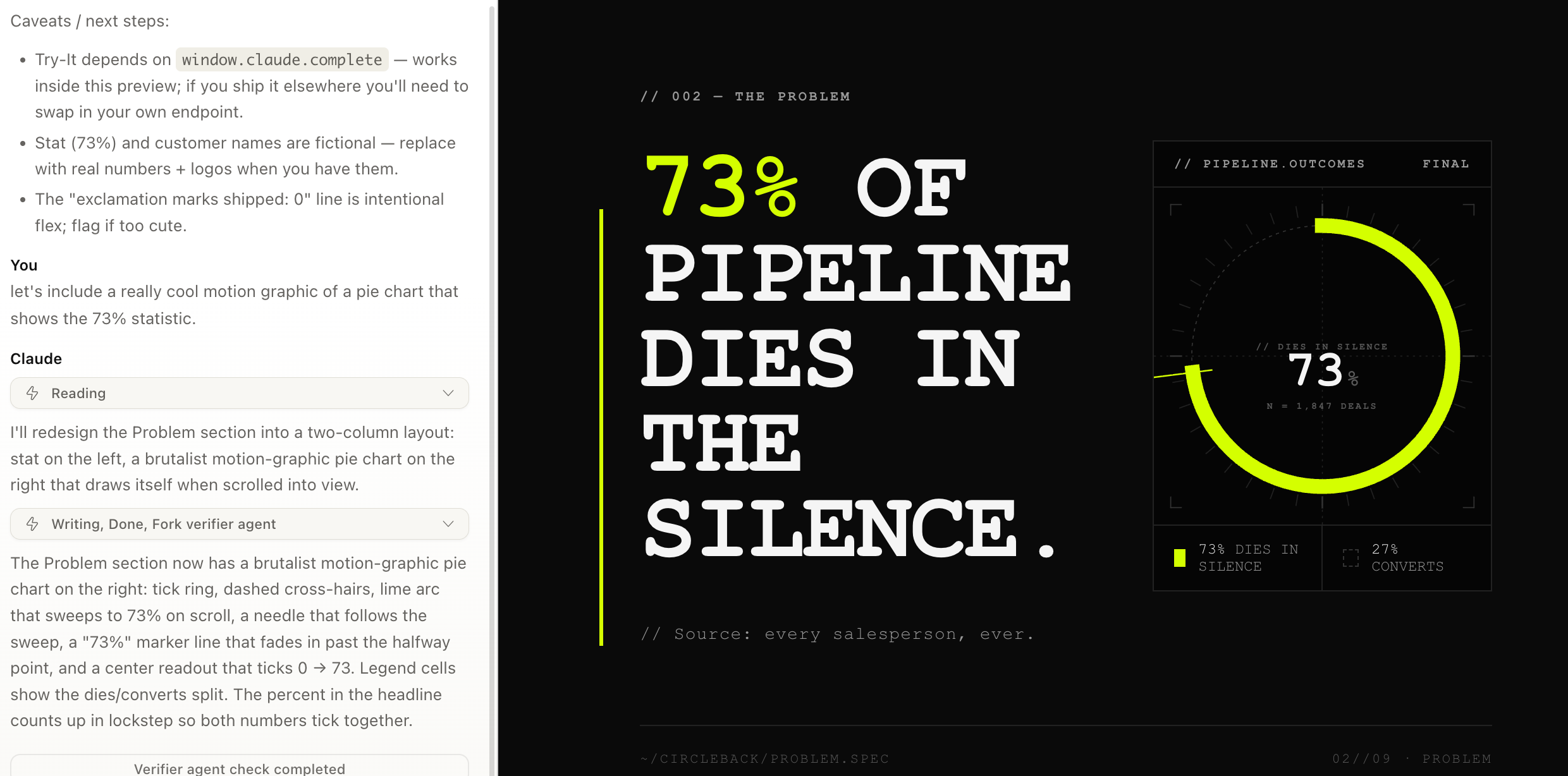
**02 // THE PROBLEM**
A single brutal stat rendered massive: `73% of pipeline dies in the silence.` Below it in smaller mono: `// Source: every salesperson, ever.` A 3px lime accent rule running down the left margin of this section.
**03 // HOW IT WORKS**
Three numbered steps in a horizontal three-column grid. Each step in a bordered card: `01_CONNECT` (your inbox), `02_CONFIGURE` (your cadence), `03_WALK_AWAY`. Each card gets a custom geometric SVG icon drawn in code. Lime numbers, white labels.
**04 // THE CADENCE** *(scroll-triggered animation)*
Build a horizontal SVG timeline that draws itself as the section scrolls into view. Three lime dot markers positioned at 72h / 7d / 14d. As each marker activates, a small follow-up email preview card slides in from the right with real draft copy in Circleback voice. Use `IntersectionObserver` with a 0.3 threshold. Sharp 150ms transitions, no spring physics.
**05 // FEATURES**
Four-column grid: Smart Cadence, Tone Matching, CRM Logging, Polite Auto-Pause. Each card has a custom geometric SVG icon drawn in code (do NOT use icon libraries), a one-sentence description, and a small `// see how` link that expands an inline detail block on click.
**06 // TRY IT** *(the showcase moment — use `window.claude.complete`)*
Interactive widget titled `// GENERATE A FOLLOW-UP`. Two inputs: recipient name, days since last contact. One `// EXECUTE` button. On click, call `window.claude.complete` with a system prompt that produces a Circleback-voice follow-up email (warm, dry, considerate, under 80 words, no exclamation marks) and stream the response into a terminal-style output panel with a blinking lime cursor while generating. This is the killer demo. Make it work flawlessly.
**07 // PRICING**
Three tiers in horizontal cards: Solo Circler ($19/mo), Team Circler ($49/seat), Enterprise Circle of Life (Contact us). Working monthly/annual toggle that smoothly count-up-animates the prices on switch. Middle tier highlighted with a 2px lime border. Each tier lists three features in mono.
**08 // SOCIAL PROOF**
One large dry pull-quote from a fictional Head of Sales: *"I haven't manually written 'just bumping this' in eight months. I am free."* Below it, a strip of six fictional B2B company names rendered as monospace text in lime, no actual logos.
**09 // FOOTER CTA**
Quiet repeat of the primary CTA. Below that, a terminal-style footer that looks like an active CLI session: lime `$` prompt, a fake `circleback --status` command, and output showing made-up live stats (`47,281 follow-ups sent this week / 0 awkward conversations`). At the very bottom, a metadata row in Courier 8pt: DOCUMENT / BUILD / DEPLOYED / VERSION.
---
## Motion spec
- All transitions: 150ms `cubic-bezier(0.4, 0, 0.2, 1)`.
- No spring physics. No bounce. No fade delays over 200ms.
- Cuts beat fades for state changes.
- Scroll-triggered animations via `IntersectionObserver`, threshold 0.3.
---
## Do NOT
- Use any color outside the brand palette (`#0A0A0A`, `#F5F5F5`, `#D4FF00`, `#FF2E92`, `#9A9A9A`).
- Use any rounded corners or drop shadows.
- Use stock illustrations or images of people.
- Use any icon library. Draw every icon as inline SVG.
- Use Inter, Roboto, or any Google Font. Courier New for display, Helvetica for body. Period.
- Add "Powered by AI" badges, sparkle icons, or any ✨ emoji anywhere.
---
## Done looks like
A homepage that a brutalist front-end studio in Berlin would ship for a real YC company in 2026. It should feel like it was built by the same people who built linear.app or vercel.com, except they're selling deeply earnest follow-up software with a completely straight face.Hit send. Claude will start building — this first generation usually takes a few minutes. While you wait, scroll through the prompt and notice how specific it is. Notice how many constraints it sets. Notice how it ends with a clear "done looks like" picture, not a vague aspiration. That specificity is what gets you a polished page instead of a generic SaaS template.
Step 6: Edit the page just by prompting
Claude will spend a few minutes building. When it's done, you'll see your homepage rendered live — the brutalist hero, the 73% stat, the cadence timeline, the Try-It generator, all of it.
Now the magic move. To edit anything on this page, you just keep talking. No code editor. No design inspector. No hunting for the right CSS variable. You stay in the chat.
Type this into the chat input:
let's include a really cool motion graphic of a pie chart that shows the 73% statistic.Hit send. Claude will find the Problem section, design an animated pie chart that visualizes the 73% stat, and slot it into the layout. You'll watch the page update in place — the new graphic appears, animates in, and just works.
Notice how casual that prompt is compared to the build prompt. You don't need a 700-word brief to iterate. Once the design system and the page exist, Claude has all the context it needs. Conversational requests are enough.
And you don't stop at one edit. Keep going. Try this next:
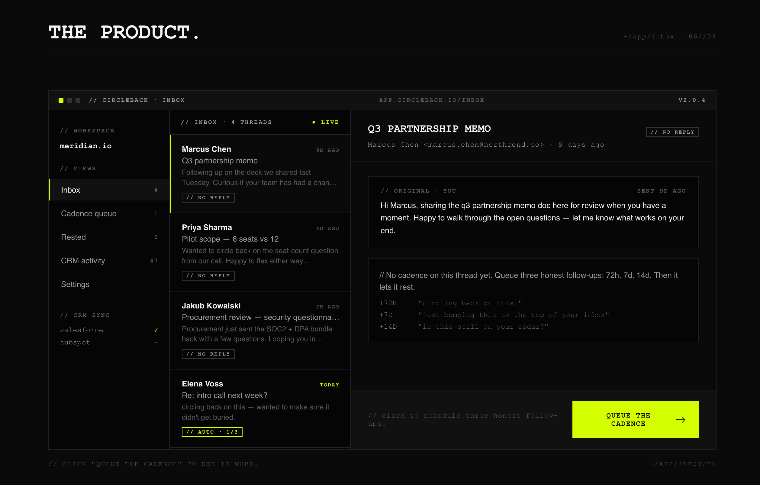
awesome, now let's include a full mockup on this page of what the product looks like and show it working.Claude will design a working product mockup — an inbox view of CircleBack actively drafting, sending, and tracking follow-ups — and embed it somewhere in the page. Each prompt you send builds on the last. The page evolves through conversation, one move at a time.
And you don't have to limit yourself to adding things to one section at a time. You can reshape the whole design with a single, broad prompt. Try this:
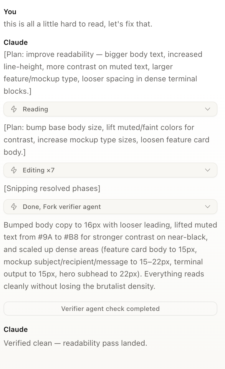
this is all a little hard to read, let's fix that.Claude will audit the entire page — type sizes, line lengths, contrast, hierarchy, spacing — and rework all of it together. Not a patch on one section. A real pass across the whole design. That's the kind of move that would take a designer a half-day. You get it back in a minute.
This is the loop you'll spend most of your time in: look at the page → describe what to change → watch it ship. Same pattern for any edit you'll ever make:
- "The hero feels too corporate. Make it weirder."
- "Replace the third pricing tier with a free trial card."
- "Add a real interactive ROI calculator below the features."
- "The cadence timeline animation feels janky. Use a softer ease and slow it down."
Specificity helps, but you don't have to be precious about it. Try things. If you don't like what comes back, tell Claude what's wrong and ask for another pass. The page is yours to shape.
Step 7: The on-canvas tools
Chatting isn't your only way to refine the design. At the top of the canvas, you'll find four direct-manipulation tools. Use them when pointing at something is faster than describing it.
Tweaks
Change what you want. The all-purpose adjustment tool. Drop a quick instruction and Claude applies it without making you spin up a new prompt thread.
Comment
Click an element and leave a comment. Good for queuing up todos, tagging things you want to revisit, or leaving notes for a collaborator. Comments stay attached to the element they're on, even as the design evolves around them.
Edit
Basic edits. Typo fixes, copy swaps, quick text changes — no need to spin up a new prompt for any of it. Click in, change the words, done.
Draw
Circle things. When you want to point at something and say "this here — fix this" instead of describing it in words, sketch directly on the canvas. Claude reads your annotation and acts on it.
You'll move between chat and these tools fluidly. Big conceptual changes still live best in chat — they need the long-form context. Spot fixes, focused tweaks, and pointed visual feedback live on the canvas. Use whichever is faster for the move you're trying to make.
Step 8: Share, export, or hand off
Once your homepage is in good shape, click Share in the top right. The panel that opens does a lot more than just copy a link.
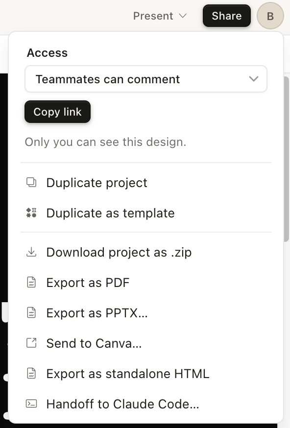
Access & collaboration
- Teammates can comment — the access dropdown. Control who can see the design and what they can do: view, comment, or edit.
- Copy link — share the live design directly. Anyone with access can open it in their browser, leave comments, and follow along.
Reuse the work
- Duplicate project — make an independent copy of this design. Good when you want to fork the work and try a different direction without losing the original.
- Duplicate as template — save this project as a reusable starting point for future designs.
Export
- Download project as .zip — the full project files, archived for offline use.
- Export as PDF — a flat document version. Good for emails, handouts, and prints.
- Export as PPTX — drop it into PowerPoint or Google Slides.
- Send to Canva — open the design in Canva for further editing with their tools.
- Export as standalone HTML — a production-ready single HTML file. Put it on a server and ship.
- Handoff to Claude Code — push the design into a real codebase via Claude Code. The cleanest path from prototype to production app or marketing site (more on this below).
A closer look at "Handoff to Claude Code"
This one deserves its own moment. From my own experience, this is the single best way to get a design out of Claude Design and into something you can actually ship.
The two products are built to complement each other. Claude Design is the UI-driven space for visual work — fast iteration, conversational edits, on-canvas tools. Claude Code is built for actually constructing software — reading and writing files, refactoring, plugging into an existing codebase. (I rebuilt the entire Masset marketing site this way — here's how that went.) The handoff stitches them together.
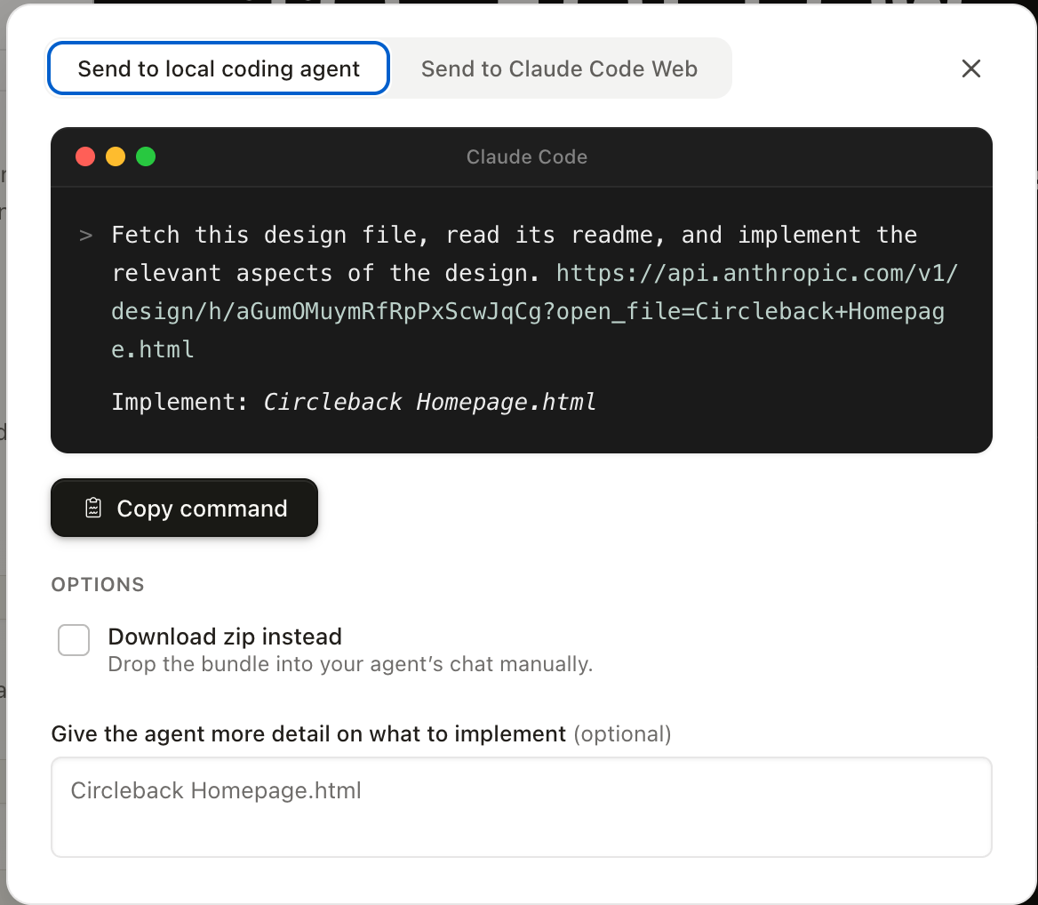
Click Handoff to Claude Code and you get a pre-built command, ready to copy. The command does two important things:
- References your design as an online file. Your CircleBack project lives at a URL on Anthropic's API. The command points Claude Code straight at it. No manual export. No copy-pasting frames.
- Tells Claude Code exactly what to do with it. The prompt is something like "Fetch this design file, read its readme, and implement the relevant aspects of the design." Enough context to start building the real version in your codebase, with the design as the source of truth.
Two delivery paths: Send to local coding agent (your terminal Claude Code session) or Send to Claude Code Web. There's also a Download zip instead toggle if you'd rather drop the project bundle into your agent's chat manually, plus an optional notes field for any extra implementation guidance.
The result: Claude Code reads the design, follows the structure, and produces real code in your project. The prototype you built in five minutes becomes a real shipped page — without anyone hand-converting frames into components.
For most class demos, you'll use Copy link. When it's time to ship something real, Export as standalone HTML or Handoff to Claude Code are usually the right answer. Everything else is there when you need it.
Step 9: See it live
Here's the homepage we just built, exported from Claude Design as a single self-contained HTML file and embedded directly into this article. Scroll through it. The brutalist hero, the 73% pie chart you prompted into existence, the cadence timeline that draws itself on scroll, the pricing toggle, the terminal footer — all of it is in the iframe below, live and working.
One caveat: the Try-It generator in section 06 calls Claude's API at window.claude.complete, which is a Claude Design runtime helper. Outside the design tool, that section won't actually generate follow-up text — but the rest of the page works exactly as it did inside Claude Design.
That's the whole arc of the class right there. The page started as a one-line product description. Then a brand guide. Then a build prompt. Then three conversational iterations. Now it's a working webpage you can share, host, or hand off to engineering. Total time from blank canvas to this iframe: under an hour.
Now go play
That's the class. Hope it helped.
The best way to actually get good at Claude Design — same as anything else in AI — is to just use it. Open it up. Start a project. Try prompts that are too vague. Try ones that are over-specified. Click every tool in the toolbar and see what it does. And when you don't know what's possible, ask Claude directly. Type "what can you do here?" and let it tell you.
Most of what you need to know is on the other side of an hour of playing around.
Have fun. Build something weird.
— Ben