It Started On My Family Group Text
I live in Utah, and the last couple of weeks here have been wild. Fires everywhere, smoke sitting in the valley, evacuation notices popping up. My family group text turned into a running feed of "is this one close to you" and "wait, where is that fire actually burning."
Here is my problem. I am a visual learner, and I am genuinely bad at geography. Someone would mention the Iron Fire near Eureka and I had no real picture of where that was or how big it had gotten. The news gave me numbers. Forty thousand acres. Twenty six percent contained. I could not feel any of it.
So I did the thing I keep telling everyone to do. I had AI build me the view I actually needed. A map of Utah with every active fire drawn on it, at real size, so I could finally see what was going on and send it back to my family.
Here Is The Map
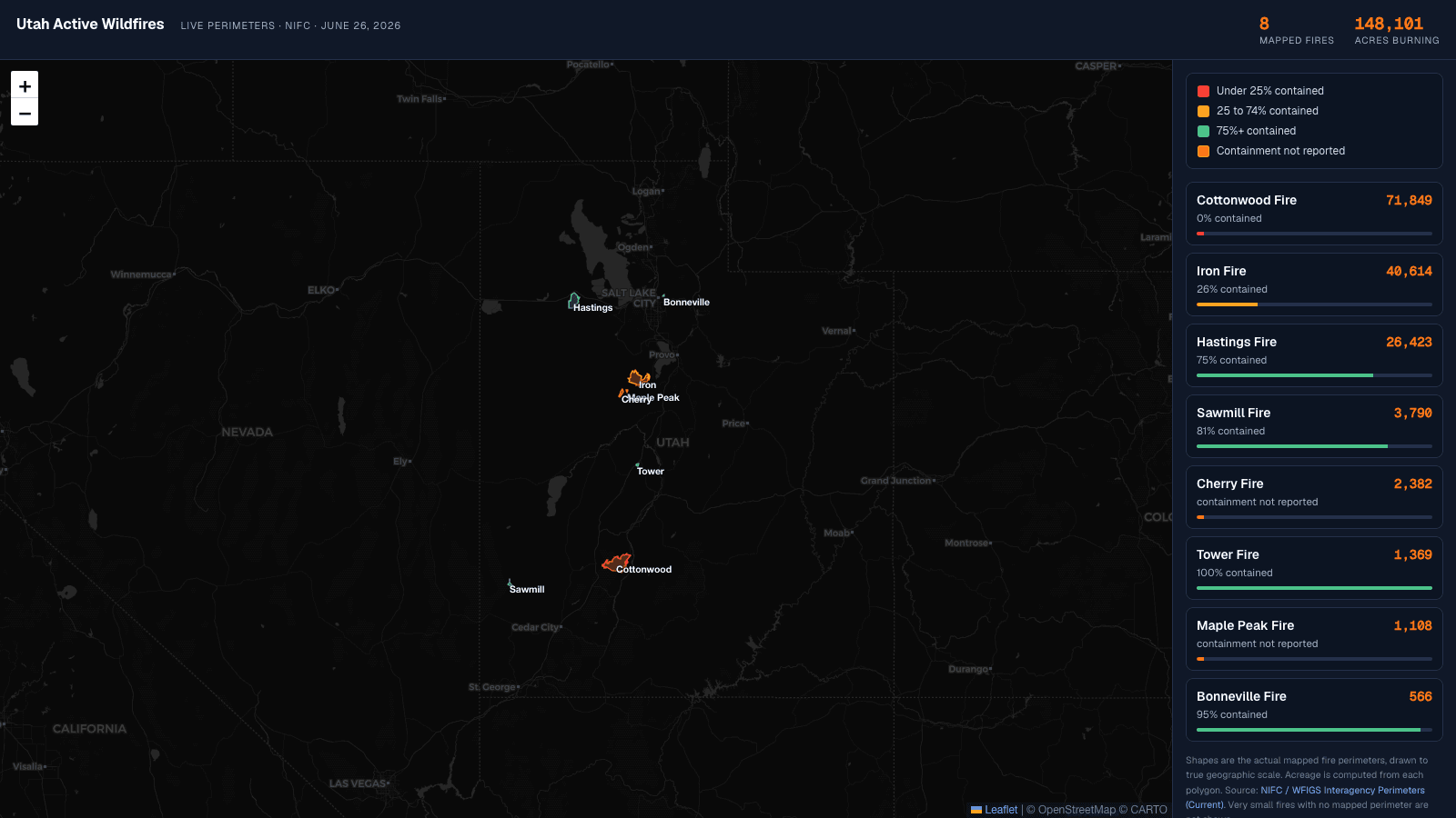
This is the real thing, embedded right here in the page. It pulls the actual mapped fire perimeters, not dots or guesses, and draws them to true geographic scale. Click any fire to zoom in. Red means barely contained, green means mostly out, and the side panel ranks every fire by size.
Here is the same data in plain text, as of June 26, 2026, eight mapped fires totaling 148,101 acres, sorted biggest to smallest:
- Cottonwood Fire: 71,849 acres, 0% contained. Fishlake National Forest near Beaver.
- Iron Fire: 40,614 acres, 26% contained. About four miles northwest of Eureka.
- Hastings Fire: 26,423 acres, 75% contained. Tooele County, south of Interstate 80.
- Sawmill Fire: 3,790 acres, 81% contained. Iron County, near Beryl and Lund.
- Cherry Fire: 2,382 acres, containment not reported. Juab County.
- Tower Fire: 1,369 acres, 100% contained.
- Maple Peak Fire: 1,108 acres, containment not reported.
- Bonneville Fire: 566 acres, 95% contained. Salt Lake City foothills above Red Butte Garden.
How I Built It, And The Part I Got Wrong First
Start to finish, this was an afternoon. No special software, no design tool, just a conversation where I described what I wanted and corrected it until it was right.
First I had AI pull the current fires from the news so I had names and acreage to work with. That got me a list. Then I asked it to put that list on a map of Utah.
The first version was wrong, and it is worth telling you how, because the mistake is the whole point. I had it drop a flame icon on each fire and scale the flames by acreage. It looked great. It also lied. A pile of flame icons made every fire look like a raging inferno the size of a county, even the small ones that were almost out. The picture oversold reality, and a picture that oversells reality is worse than no picture at all.
So I changed the ask. Drop the flames. Go get the official fire perimeters from the federal wildfire feed and draw the actual shapes on the map, colored by how contained they are. That one change is the difference between a graphic and a map you can trust. Now the Cottonwood Fire is a huge red blob south of Provo and the nearly contained fires are small green outlines, exactly as they are on the ground.
The Real Lesson, And It Is Not About Wildfires
I did not build this for work. I built it for my family. But the reason it counts toward my 100-day challenge is the same reason it matters for anyone in marketing.
If you are trying to explain data, take the two seconds and have AI put it into a format that actually makes sense for the business. That is the entire move. Not a spreadsheet you forward and hope someone reads. Not a wall of numbers in a Slack message. The shape that makes the point land.
For me that was a map, because I am a visual learner and a list of acreage means nothing to me. For your audience it might be a chart, a simple before and after, a single highlighted number, or a one-line story. The skill is not the tool. The skill is knowing the format that teaches the way your reader needs to be taught, and then spending the two seconds to make it.
The same AI that helped me understand a wildfire season can help you turn your messy data into something a customer, an executive, or a teammate gets in one glance. You just have to ask for the right shape, and fix it when the picture lies.
“If you are trying to explain data, take the two seconds and have AI put it into a format that actually makes sense for the business.”
A Few Honest Notes On The Data
The fire shapes and acreage come straight from the official federal perimeter feed, so the sizes are real, not estimates. A few caveats so I am not overselling it the way those flame icons did.
- It is a snapshot from June 26, 2026. Wildfire numbers move every day. Treat this as a point in time, and know that rebuilding it with fresh data is a two minute job.
- A couple of small fires, like the Dutchman Fire near Saratoga Springs, do not have a mapped perimeter yet, so they are not on the map. Very small fires usually get a point before they get a polygon.
- Two fires report no containment percentage in the source, so I labeled them honestly as "containment not reported" instead of guessing a number.
That is the build. A map for my family, an afternoon of work, and a reminder that the gap between data and understanding is usually just a two-second decision about format. If you want the bigger version of this story, it is part of my 100-day build-in-public challenge, where I ship something with AI and try to get a little better at this every day.
Key Takeaways
- The fastest way to understand messy data is to have AI reshape it into the format you personally learn from, whether that is a map, a chart, or a simple list.
- The first version made the fires look bigger than they were. Accuracy beats impressive. Use real source data and check that the picture matches reality.
- Official fire perimeters from the federal NIFC feed are public. A huge amount of the data you could be visualizing is public too.
- For marketers: stop forwarding raw numbers. Spend the two seconds and turn data into a view that makes sense for the business before you share it.
- This took an afternoon and no special software. The skill is asking for the right format, then correcting it when the picture lies.